Wednesday, July 27, 2011

Step away from the painting

At the end I keep touching this up, dabbling, adding that there and this here, and waiting for a voice over the loud speaker to tell me to put my brush down and step away. I have such a hard time stopping! Honestly, I tend to quickly tell my husband before I regret it, "Hurry! Come take a photo and take it away!" He's so helpful to have around :) And he's great - when I notice one last thing I really have to change, he always gives it back to me. What would I do without him?
Anyway, so I think it's done. There are a few things I like about what I did tonight. I, much to my surprise, like the boats. I was worried about them, since there were so many blobs of stuff in the photo that wasn't too readable, and because they were at different funky angles, but somehow it worked out. At least I think it did. I like the white masts across the water. I like the stones in the foreground. I think I like all the vertical lines in a horizontal painting. I'm not sure about the vibrancy of color across the water. Shouldn't it have been more faded due to atmospheric perspective? I wish the cement platform thing at the bottom of the lamp was taller. Silly detail to bother me, but I feel like it would have worked better. And I'm not sure that the water isn't just a bit boring. But the water isn't always the star of the show, right? Overall, I'm happy with it. And it's done.

Tuesday, July 26, 2011

Servicio Gondole Day 2

I started out painting a beautiful blue sky and then, it just didn't want to stay that way. So I dabbled. Is it believable? I'm not in love with the shapes the clouds form but I like their color and feeling. Oh and you might have noticed the gondelier didn't make the cut. It just was too much in that corner. Sad, cause I liked the idea of him, he just didn't fit. Hope to get back to it tomorrow because there's a lot more to do!

Monday, July 25, 2011

Considering the drawing

Old lanterns are really cool. I'm pretty excited about to paint this one. However, I'm not so sure about the little gondolier guy in the corner. I don't usually put people in my architecture/water paintings. The one time I did they looked kinda funky/cheesy. Should I leave the guy or take him out? If I leave him does he need to be bigger? Is that why he looks a little funny? And compositionally speaking, is he making the corner too heavy? Also, I'm thinking of moving the tall tower more to the left, so that it can divide the horizon into more equal thirds. Would that be stronger? Lots of questions! Looking for the best composition usually does that to me! I had this painting professor once who watched me draw and paint a whole still-life painting and then gave me a C- on it because the composition was weak. Something he easily could have mentioned to me before I even started painting. As a straight-A student, I was a bit peeved about it, needless to say. And rather grudgingly, I will also admit that because of it, ever since I've been a lot more careful about making sure I have a composition worth spending the time to paint. Hence the questions. I'm leaning towards removing the gondolier.

Saturday, July 23, 2011

Still needing a title...

 So after a week of packing and moving and unpacking, and then leaving on a family vacation that had been planned way before we knew we were going to move, I've finally been able to get my brushes back out and even post again. And painting makes it feel like a vacation to me, helped out by the gorgeous weather we're enjoying on the Oregon Coast. Only downside would be all the sand my baby keeps trying to eat, but what can you do. Anyway, about the painting. I always do a plain blue gradient sky but I decided to try to put some clouds in, and they were a pleasant surprise. All the architecture came along quickly, which was also nice. Then I got to move on to the greenery and the water - my favorites!
It feels like a lovely place to be. I don't think it's the best water I've done, but I really like the statues and the colors. I pumped them up quite a bit from the photo, which I included, because I tend to do that. I can't help it; I just like color a lot. I don't see the world as being muted or drab and sometimes I might take it too far in the other direction, but I'd rather that than risk being hum drum. Like always, I'd welcome any suggestions. Is there anything you don't like or that doesn't work? Is the brightness too much? Reflection interesting? Perspective believable?

Thursday, July 14, 2011

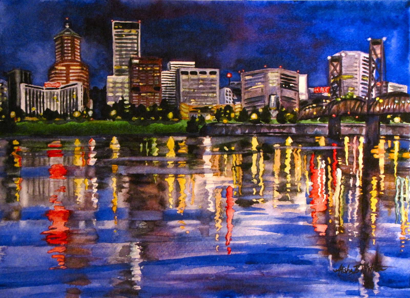
For the Newlyweds

Now that it's finished, here's wishing you guys a happy marriage! Congrats. I hope you like it. Painting water is so my favorite thing to do with watercolors. Watching reflections in person is so mesmerizing, and it so looks like a constantly changing painting across the water. Like God's finger is just playing with the colors. And reflections do the most fascinating things. For example, those small little lights reflected nearly across the whole river. And made a rather so-so painting into something more lively and exciting. It was way fun to paint and I'm pretty happy with the result. Especially because I think it evokes that "there's no place like home" feeling, and a love for home that I was hoping for.

Tuesday, July 12, 2011

There's No Place Like Home

So I've been having this little argument in my head over whether or not I should post this picture since it's a gift for somebody who, when not too busy, tends to look at this blog. I knew she'd knew it was for her immediately, since it's what she asked for. I probably should have just waited and left it to be a surprise, but the other side of the argument won. For three reasons. Good ones I think. First, if my sister hates it, she can tell me and I'll stop wasting time and go back to packing. Which is what I should have been doing in the first place but I REALLY needed a break. Second, to prove to my brother-in-law that I am actually going to come through on my promise of painting them a picture for their wedding. I don't think he believed it anymore ... 11 months later. And thirdly, in an effort to remind them (every time they look at the painting) where home is (that would be Portland, Oregon) so they don't fall too in love with New York and stay there forever. It's way too far away. Basically the other side of the world. So there you go. Good decision?

Sunday, July 10, 2011

Wouldn't it be nice ...

if the painting just told me it was done when it was finished? It could set off a nice little ding, or a THE END sign could pop up. That way I could know it was done and couldn't be made better with more working. I'd put it out of my mind and stop tinkering with it, especially knowing that doing more would for sure make it worse. That would be cool. Since it won't happen, what do you think. Is it finished? Any suggestions? I do know that it makes me want to be there, so  that makes me feel good about it. I say with about 85% assurance that it is done.