Thursday, February 25, 2016

Paul Klee lesson

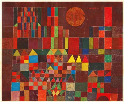
This was such a great lesson! Paul Klee works so well with young artists because of his simplification of his subjects, his appreciation for children's art, his bright colors and dreamlike and imaginative paintings! We started out touching on some of the highlights from his life looking through the book, "Artists in Their Time: Paul Klee." Then I flipped through "Dreaming Pictures with Paul Klee" and had them tell me the first thing that came to mind when they saw the images. Somewhat surprisingly, they got so into this! Then we looked at or inspiration piece, Castle and the Sun: 


I said how it made me think of building blocks with my kinda and dumped a bucket of them out on the table and told the kids to get their creativity flowing by building some castles out of the blocks. My students were up to eleven years old and they all loved this. From there I gave options that divide up well into different age-suitable versions of our projects. 
The youngest student ate her paint:
The next youngest built her castle,
Traced a few blocks randomly, making most into people or monsters with people in their tummies, outlined with oil pastel with a little help and then painted with water colors on top:
The next age group built a castle flat on his paper, 
Traced his castle, block by block,
Went over his outline with a black oil pastel,
And painted each shape a different color, careful not to cross the black line. He's kinda particular about order and stuff so this project was perfect for him:
My 9 - 11 year old group built their castles and then drew them on their paper or just used them as inspiration and went through the rest of the steps like my son did:
The finished projects were pretty cool:
The second group used them as much looser inspiration. They mainly drew and outlined and then divided it up into shapes of their imagination. Different but cool:
The kids all seemed to enjoy it and I didn't hear any "I'm bad at ..." or "I can't do ..." So a definite win!

Wednesday, February 24, 2016

Reflecting twice over

I complained tonight after finishing that I made so little process. My kind husband pointed out that since I'm doing two paintings at the same time, it's always going to feel like I've accomplished half as much. He's good at math like that!
But you can see how they're the same painting now, right? Or at least from the same source. I like how the shapes are developing. But do you know what's hard? Reflections! Getting it the same, but upside down and tilted in the opposite direction and in the painting on the right's case, twice as long? It's hard. But who doesn't need a good challenge when they're painting exhausted at midnight, right? Nature just makes it look so easy.

Tuesday, February 23, 2016

Reflections x2!

I haven't been painting a lot lately but I bought a little sketchbook and have been sketching my kids daily, in kind of a visual journal of little things we've been up to. I'm totally out of practice! But it feels good to be stretching those muscles a little, getting back to basics. Now if only they'd stay still long enough for me to get a good drawing in 😉 
One way or the other though, it got me inspired. That and a beautiful sunny day today that seemed to just leave us all in a happier mood. So I pulled out an old photograph - I think it's from 4 or 5 years ago. I don't usually do this but I'll share the inspiration photo here:
I'm so drawn to this peaceful scene with the crystal reflection but I've never actually sat down to paint it. After a few thumbnail sketches designed to help me choose the best composition, I remembered why - I can't decide how I want to go about it. So I didn't choose! I taped two pieces of paper down, side-by-side and got started painting the same picture twice. At the same time! Never done that before but I'm happy with the results so far. Funny how they don't look at all the same so far!

Can't wait to see where it goes tomorrow.

Thursday, February 11, 2016

Jim Dine Valentine's Day Lesson


I had something else planned but decided to go with hearts for Valentine's Day, and who better to look to than Jim Dine?
I started with a quick background into the why of pop art - how Expressionism and then Abstract Expressionism had made art into more of an elitist thing. The kids got a kick out of that and compared it to the "Emperor's New Clothes." Might be on to something there. I felt like it was a necessary background into why big paintings of everyday things would be any kind of a big deal. We flipped through some images by Warhol and Lichtenstein and then watched this short video introducing Jim Dine: https://www.youtube.com/watch?v=n7SWRa1gvfc


With the first group, we drew an outline of the heart with a black oil pastel and then experimented with wet-into-wet technique inside the heart. I love seeing kids experience the fun of that for the first time! Then we did wet-onto-dry outside the heart. It was a fun, laid-back project that they mostly enjoyed. However, next time I wouldn't use liquid watercolors because they got diluted and one student didn't like the loss of color. The same student was disappointed in the results but I tried to stress that today it was the experimenting that was more the focus, not the result. Sadly, some kids'll never buy that. Reminds me of a younger, perfectionist version of myself before painting helped loosen me up a bit!

With the second group, I decided to use this second image as our inspiration instead. We started by drawing the heart in the middle with oil pastels, trying to make it look 3-D with shadows and highlights. Then we painted the background with watercolors. I showed them how they could leave a thin line between the squares if they didn't want them to bleed into each other at all or how they could, using wet-onto-dry, allow them to brush up against each other and blend just slightly. It was fun to see the different results!

Wednesday, February 10, 2016

Two by two

This may be silly to post but "these things are fun and fun is good" as the Cat in the Hat says. My parents just finished a major remodel and turned an unused office into a playroom. It had a large empty wall that was just begging for something bright and fun. So pink tigers and purple hippos to the rescue! All that time in Noah's ark must've dulled their colors a bit :) It should be said that my daughter is rather upset that a moose made it on but a horse didn't. A MOOSE mom? Really? A MOOSE? Ha!
Obviously not my typical painting but it was still an opportunity to be creative and get my brushes wet!

Monday, February 1, 2016

Sunbathing Tulips

FINISHED! I've got a kink in my neck and a severe need for catch-up sleep, but I am proud to say I finished on time! I'm pleased with the results. And so very tired.
Watercolor on paper
29x22

Background Time

I love painting the light shining through tulips, but I gotta admit, I also really love greenery. Guess I must be a true Oregonian after all. :) However, it is a bit of a jungle in there under this bunch of growing tulips and it's not the easiest thing to keep straight. Obviously it doesn't have to be exactly like it was in the photograph but it has to make sense and be varied and be colorful but not detract from the tulips too much. All at the same time. Luckily, that's not too much pressure. Ha! 
I love putting the super dark color behind the light tulips. While it doesn't make a ton of sense logically since they're back-lit, it makes for an awesome pop. One more day of painting, and I hope she'll be ready.